NBA logos are more than mere emblems; they are symbols of passion, identity, and belonging. These carefully crafted images represent franchises, evoke memories, and ignite fierce rivalries. Instantly recognizable worldwide, they stand as testaments to the power of sports branding. The silhouette of Jerry West, forever immortalized in the NBA’s primary logo, continues to spark debate and discussion, highlighting the profound impact a single image can have.
This article explores the fascinating world of NBA logos, delving into their evolution, unraveling the controversies, and examining their cultural significance. From the drawing board to the basketball court, the journey of these logos reveals a captivating narrative of design, marketing, and fan engagement. Beyond aesthetics, NBA logos represent a multi-billion dollar industry, influencing merchandise sales, team identity, and the overall perception of the sport. Get ready to discover the stories behind the logos that define the game.
Before the Silhouette: NBA’s Early Identity Crisis (1946-1969)
The early days of the NBA, stretching from 1946 to 1969, were marked by a struggle to forge a strong, recognizable visual identity. Born from the merger of the Basketball Association of America (BAA) and the National Basketball League (NBL), the league lacked a unified brand. This initial period was a branding free-for-all! Early marketing efforts struggled to capture the excitement of the on-court action. The logos of this era reflected the visual incoherence causing a lack of brand recognition. The rise of the American Basketball Association (ABA) acted as a branding wake-up call to modernize its image and capture a broader audience.
The BAA and NBL Era
Prior to the NBA’s formation, the BAA and NBL each sported their own logos. The BAA logo, visually uninspiring, failed to capture the essence of the sport. Similarly, the NBL logo suffered from a lack of visual impact and memorability. These early attempts at branding lacked the professional polish and creative spark needed to resonate with fans. It failed to establish a strong league identity, which is critical for fan engagement and merchandise sales. These visual shortcomings highlighted the need for a comprehensive rebranding strategy that would ultimately lead to the iconic NBA logo we know today.
Jerry West: The Man in the Silhouette and the Controversy
Jerry West, a name synonymous with basketball excellence, is forever etched in the sport’s history not just for his on-court achievements but also as the inspiration for the iconic NBA logo. Designed by Alan Siegel, the logo is a silhouette of West in action, a visual representation of skill, agility, and the relentless drive that defined his career. While the NBA has never officially acknowledged West as the model, the resemblance is undeniable, a fact widely accepted and understood by fans and players alike.
However, West’s association with the logo has not been without its complexities. While he appreciates the recognition, he has also expressed discomfort with being its face, even suggesting that the league consider alternatives. This sentiment, coupled with the tragic loss of Kobe Bryant, has fueled a recurring debate: should the NBA logo be redesigned? Advocates for change argue that honoring Bryant, a player of similar stature and impact, with the logo would be a fitting tribute. The emotional weight of this argument is substantial, resonating deeply within the basketball community.
The NBA faces a complex decision. Changing a logo so deeply ingrained in the league’s identity is a monumental undertaking. Consider the branding implications, the potential backlash from traditionalists, and the sheer logistical challenge of updating merchandise, marketing materials, and everything else bearing the current emblem. Other major sports leagues have faced similar crossroads, weighing the desire to evolve against the value of established brand recognition. The NBA’s choice will undoubtedly set a precedent, influencing how other organizations navigate sensitive issues of legacy, representation, and change.
West’s Legacy and Design Implications
The NBA logo’s design subtly encapsulates Jerry West’s impact on basketball. The silhouetted figure, caught mid-dribble, showcases his agility, control, and the explosive power that defined his game. It’s not just a static image but a captured moment of dynamic action, representative of the NBA’s fast-paced and exciting nature. Detractors of a change argue that the current logo represents an era of basketball; a simpler time when core skills were a key part of the sport.
The Birth of an Icon: Alan Siegel and the Creation of the NBA Logo
The NBA logo, a symbol recognized globally, wasn’t born from focus groups or complex marketing strategies. Instead, it emerged from the vision of Alan Siegel, a branding expert tasked with crafting a visual identity for a league on the rise. Siegel, known for his work with numerous high-profile brands, approached the NBA project with a desire for simplicity and impact. He sought to capture the essence of basketball – the movement, the energy, and the athleticism – in a single, enduring image. The resulting logo transcended its original purpose, becoming an integral part of NBA branding and a lasting testament to effective design.
Design and Inspiration
Siegel opted for a dynamic silhouette of Jerry West, derived from a photograph, to embody the sport’s motion. Red and blue were chosen for their association with Americana and their vibrant, energetic qualities. The design incorporated white space to create balance and visual symmetry, ensuring clarity and impact. This design wasn’t accidental; it was born from studying sports logos of the time and aiming for something timeless yet energetic. As Siegel once mentioned, he was “tired of looking for a sign,” thus setting the parameters of this project toward simplicity and instant association of what became one of sports’ most recognizable trademarks. These elements combined to create a logo that is not only visually appealing but also deeply connected to the spirit of basketball.
Team Logo Evolution: From Mascots to Modern Minimalism
Evolution Of Branding
The evolution of NBA team logos reflects broader trends in sports branding, moving from often cartoonish and complex mascots to sleeker, more modern designs. These changes aren’t just aesthetic; they represent shifts in team identity, marketing strategy, and even cultural relevance. Examining the logo histories of several key franchises reveals a fascinating story of adaptation and reinvention.
Take the Chicago Bulls, for example. While their iconic bull head logo has remained largely consistent, earlier versions featured a more realistic, almost fierce depiction. Over time, the logo was refined and simplified, becoming the aggressive yet iconic image we recognize today. This evolution speaks to a desire for a more impactful and easily recognizable brand.
The Golden State Warriors offer another compelling case study. Their logo transformation has mirrored their geographic moves, shifting from a Native American representation in their earlier days as the Philadelphia Warriors, to a more generic warrior figure, and eventually, embracing the iconic Golden Gate Bridge imagery. This most recent shift symbolizes the team’s deep connection to the Bay Area, becoming a symbol of city pride.
Finally, consider the Boston Celtics. While their leprechaun mascot, “Lucky,” remains a core element, the overall logo has undergone subtle yet significant refinements. The typeface has been modernized, the color palette has been adjusted for better vibrancy, and the overall design has been streamlined for better reproduction on various mediums. The iconic look and feel became timeless by staying consistent throughout the team’s legendary run.
New ownership also frequently spurs logo redesigns as a way to mark a new era for the franchise. Beyond aesthetic considerations, logo evolution is a strategic decision, impacting merchandise sales, fan engagement, and the overall perception of the team.
The Business of Branding: Logo Changes and Their Impact
NBA rebranding is a high-stakes game, where a fresh logo can mean a slam dunk in revenue or a costly turnover. Redesigning a team’s identity involves significant financial investment, from hefty design fees and widespread marketing campaigns to the practical costs of replacing signage throughout arenas and retail locations. A successful rebranding can lead to a surge in merchandise sales as fans eagerly adopt the new look. It can also invigorate fan engagement, attract new sponsors seeking to align with a modern brand, and shift public perception. The gamble, however, lies in the risk of alienating loyal fans who have an emotional connection to the existing logo and team imagery. Brand perception is a delicate balance, and drastic changes can trigger backlash if not handled carefully. Financial analysis plays a crucial role in determining if the potential return on investment justifies the risks associated with NBA rebranding.
The marketing impact of a rebrand goes far beyond aesthetics. It’s about creating a narrative and connecting with fans on a deeper level. A well-executed rebranding can reignite passion, attract a younger demographic, and solidify the team’s position in a competitive market. Conversely, a poorly conceived rebrand can result in lost revenue, decreased attendance, and damage to the team’s overall brand equity.
Case Studies
The Charlotte Hornets’ return to their original moniker and teal-and-purple color scheme was a massive success, tapping into nostalgia and injecting fresh energy into the franchise. Conversely, the Washington Wizards’ attempt at a sleek, modern look initially faced mixed reactions before they reverted to a more traditional color scheme. The Brooklyn Nets’ minimalist black-and-white branding proved effective in establishing a distinct identity but was it successful in engaging the fans? Wins and losses will always affect potential revenue, but the market analysis will prove if the team’s new branding initiative does the same. Analyzing these situations provides valuable insights into what resonates with fans and what can ultimately impact the financial health of the team.
Logo Lore: Urban Legends and Untold Stories
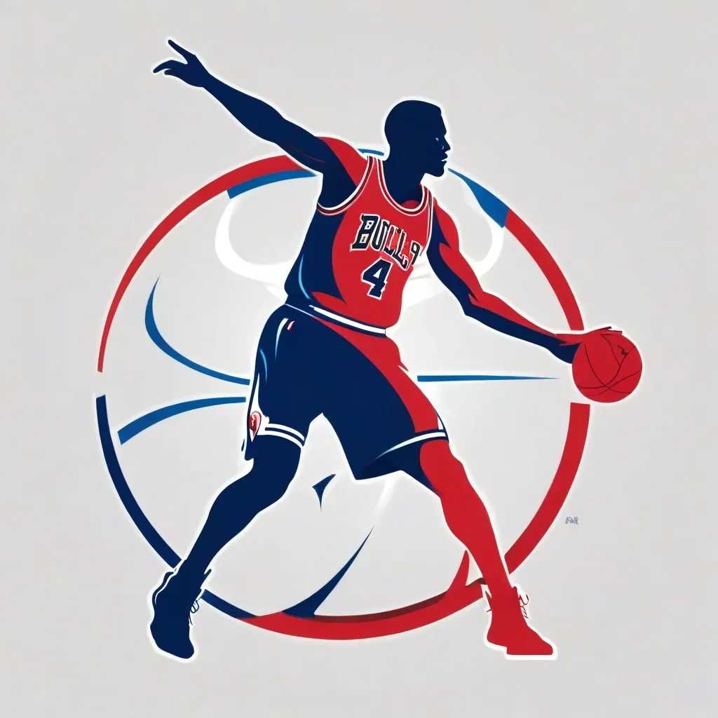
The world of NBA logos is rife with fascinating stories, quirky trivia, and persistent myths. Beyond the iconic imagery, a deeper dive reveals a tapestry of urban legends and untold tales. Prepare to have your understanding of these symbols – and perhaps your basketball knowledge – challenged.
NBA Logo Myths: Fact or Fiction? Ever heard the rumor that the NBA logo silhouette is secretly Jerry West? While the resemblance is undeniable, the league has never officially confirmed this. It’s one of the most enduring, yet unproven tales in basketball lore. Another myth surrounds the Detroit Pistons logo, with some believing the horses represent a rivalry with another team. The truth? They simply reflect Detroit’s automotive history.
Forgotten Mascots and Rejected Designs: Before the beloved mascots of today, there were… experiments. Did you know that some teams had truly bizarre mascot concepts that never made it past the drawing board? Similarly, the path to a final NBA logo design is often paved with rejected ideas. Imagine a world where the Chicago Bulls logo featured an actual bull – charging, snorting, and far less stylized!
Logo Controversies and Hidden Meanings: Sometimes, a logo’s creation isn’t without its share of drama. Lawsuits, design disputes, and even accusations of hidden messages have occasionally plagued the league’s visual identity. These controversies add another layer of intrigue to the stories behind the logos we see every game.
The Future of the NBA Logo: Modernization vs. Tradition
The NBA logo, a symbol instantly recognizable around the globe, faces a crossroads. Should it remain a steadfast emblem of basketball’s rich history, or should it evolve to reflect modern design sensibilities and the ever-changing landscape of the sport? This debate pits tradition against modernization, sparking passionate opinions among fans, designers, and league officials alike.
Arguments for modernization often center on the need for a logo that resonates with a younger, digitally native audience. Sleek, minimalist designs, integration of motion graphics, and a greater emphasis on diversity and social justice are all potential avenues for change. Think about how other major brands and organizations have refreshed their identities to stay relevant – the NBA could learn from these examples.
However, preserving tradition is equally crucial. The current logo, featuring the silhouette of Jerry West, is deeply ingrained in the collective consciousness of basketball fans. Altering it too drastically risks alienating a significant portion of the NBA’s fanbase. Moreover, the logo represents a tangible link to the league’s storied past, connecting generations of players and fans.
The NBA’s decision regarding its logo will have far-reaching implications. It’s not simply about aesthetics; it’s about preserving history while embracing the future. Perhaps the answer lies in a subtle evolution, retaining the core elements of the existing design while incorporating contemporary design trends. Or, perhaps a bold, entirely new direction is needed. The future of the NBA logo is uncertain, but the conversation surrounding its potential evolution is undoubtedly exciting.
Conclusion
NBA logos are more than just symbols; they are emblems etched into the collective consciousness of sports fans worldwide. From the classic Jerry West silhouette to the roaring Bobcats, these marks represent eras, teams, and the very spirit of basketball. They trigger memories of iconic moments, legendary players, and the intense rivalries that have defined the game.
As the NBA continues to evolve, its logos will undoubtedly follow suit, sparking debate and nostalgia in equal measure. The ongoing conversation surrounding these visual icons underscores their enduring power and the profound connection they forge between the league, its teams, and the passionate fans who live and breathe basketball. The legacy of NBA logos will continue to be written with each new season, each rebranding, and each fan’s personal interpretation of these timeless symbols.